

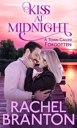
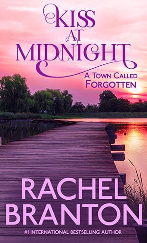
As we dug into making cover ideas for Kiss at Midnight (A Town Called Forgotten, Book 1), we realized there were a lot of romance covers that no longer have couples on them. So instead of a reveal, we are taking a poll. Couples or no? Why? Please let me know in the comments below! You can read a sample chapter of Kiss at Midnight here. Okay. So after seeing some of the comments, we’ve added choices 3, 4, and 5.
Teyla Rachel Branton
Thank you, everyone, for your wonderful comments and suggestions. We’ve come up with two final covers based on the feedback that we hope will appeal to most everyone. If you could please go to https://teylarachelbranton.com/final-voting-for-kiss-at-midnight-cover/ and vote for your final choice out of these two, I would really appreciate it. You guys are the best!
Cathy Davidson
I think I prefer #5, its beautiful
Shirl Dyer
I like #5. When does the book become available??????
Charlotte Matthews
I like #5; it a really peaceful picture and the scenery is beautiful.
Barbara
I like #5. If you want to have a couple in the picture I wouldn’t have them so large. They take up to much of the cover.
Margaret
I love the sunset scene, the colours & the writing fonts. My fav are nos 1 & 5. I like the couple on the cover, esp if they do represent the actual couple in the book. However, in this instance, I feel the couple is too large/ big & covers too much of the lovely background scene. I agree the sunset has nothing to do with midnight, but perhaps hints to what leads up to midnight, or after that kiss at midnight!
Braden wheeler
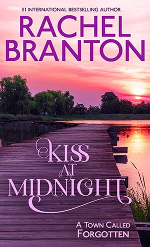
I like 1 and 4.
Leslie
I like Cover #5.
Shayla
I like #5 best of all!!!
Evelyn Corso
Cover #4 or any cover without the couple. It lacks suspense
Barbara Harrison
I LIKE the couple, but the picture is of sunset, NOT midnight!
Elsa
I like cover #1. Personally I like seeing the couple.
Ben
I think #5 is my favorite. The couple are pretty good, but if the consensus is no couple, the donut, setting of the titles, & whole layout are my preference for#t.
Having the couple isn’t a turnoff to me.
April
I like #4 best because of the placement of the words. I love being able to see the sunset. I like not having a couple on the cover because then the cover is just beautiful and anyone seeing you reading it doesn’t automatically link it to a romance novel. I like romance but not necessarily a focus on the couple on the cover.
Loralee Evans
I like couples on the cover, so Of the covers here, I say #1. But Vicki Ricks’ suggestion is still my favorite.
Sandra
Wow…that’s tough. My daughter keeps doing this to me too, with her covers. (Charlene Carr).
I am going to go with Cover number 4, but cover 5 would be a close second. There are so, so many books with kissing couples. Let’s enjoy the beautiful skies and gorgeous scenery.
Teresa
I like #5 followed by #4. If possible, I recommend making “Kiss at Midnight” a bit larger. I don’t like the couple, for several reasons. I read some posts that suggested putting a couple at the end of the pier. I think…maybe. it could detract from the very romantic setting and the romantic title font. If you do put a couple on the end of the pier, I would suggest putting them in shadow so we only see silhouettes or no more than vague physical characteristics.
Lori Meyer
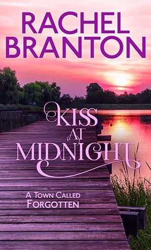
I like #2 the best so nice and pristine looking, and #1 the second best.
Susan
I like cover # 5. It’s a beautiful picture. However it doesn’t look like it’s at midnight …more like sunset. I do like covers with a couple too
Teresa
I vote for #1. Having people on the cover is what draws my attention.
Louise Pledge
#5. Cover pic is so pretty and appropriate, couple just distracts from that. No people, please!
Janis
I choose the 2nd cover
Rachel C Murdock
Cover #4
Jennifer Hammond
I vote for cover #5, I like it the best.
Jean Borden
I definitely like #1 cover. I like the couple on it.
Michele knight
No couple ,no 5 being my favorite
Jean Borden
Definitely #1. I like the couple on the cover.
Barbara Frey
I like cover #5
Mae Carr
I think the couple would be great if they were not so close. If they were like at the end of the pier & maybe not so over-powering the picture. I think it would fit the title better to be in the distances & have the actually kissing not laughing! After all that is the title of the book. I think that would make an excellent cover for your book. Having them that close in the picture is just too much. I can see it in my head but don’t know how to explain it to you. I just know it would be the perfect cover!
Teyla Rachel Branton
Several people have mentioned the same thing. We’ll see if we can find a nice couple to put at the end of the pier!
Tandy
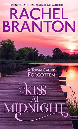
Cover 3 not keen on the couple.
Reena
Definitely the couple. The rest of the covers look a bit “empty” if you get my meaning. And since it’s a romance, what better than a couple on the cover? Without it, it could be just any other literary book 🙂
Judy K.
I like the balance of #5. I use the description the author gives to picture the couple.
Marney Smith
I prefer #6 or one of the similar versions. Both the title and your name stand out more. The title makes it obvious that it is a romance. Stay healthy!!!!!
Anna
I like the one without the couple. Covers with people on the front give a weird vibe – almost like a Harlequin romance. My teenage daughter say the same thing – they won’t read books with real people on the cover. It makes the book seem second rate somehow. I think the sky should be a night sky, because the title says “midnight”. Also you could show in shadows, at the end of the dock, very small, a couple kissing, but only their dark outline.
I don’t think it matters much where you put the ” A Town Called Forgotten”. All the placements look good.
By the way, I’m a huge fan. I’ve been reading your books since you first published your Ariana series. They are still my favorite books!
Teyla Rachel Branton
Yay! I appreciate the suggestion. We’ll see if we can find a nice couple to put at the end to please everyone, lol.
Corina Balderas
I like the placement/layout of the words on #5 but I agree with the nighttime scene. And I like the idea of a small silhouette of a couple at the end of the dock.
Sally Scully
I like cover #1 with the couple!
RJ
Cover #5 For some reason it ‘calls’ me. Not quite sure. Maybe your name placement at the bottom.
Patricia G Lougee
The couple
JJ Leonard
I really like 5, because the title is clearly readable and so is your name and I can see the picture.
Mary Davis
Cover #1! Especially with a romance, it’s more appealing to see the people. 🙂
Ken Lingenfelter
Cover 4
s
I prefer #4
Carol
Number 5
Beth Pirtle
I like #1
Nancy
I vote for the couple- just because I would pick it off the shelf to check it out but without the couple I’d probably pass it over.
Chris
No couples, I like to picture them in my mind, I prefer picture 4.
Letha Armstrong
Vote #1
Letha
I vote for cover 1
Jackie Grant
They all look awesome I would say cover 3 with cover 1s font
John
Cover #4 gets my vote
April
Cover #4 is my favorite. I like having couples on the front, but those two just don’t look right for some reason. Anyway, the title is front and center, as it should be IMO, and then the “Forgotten” is off to the side. It’s perfect!!
Lynn Hamilton
I like #4, without the couple.
I think having a couple on the cover gives a book the “M & B” romance look. Your books are much better than that.
No couple on the cover adds intrigue to the story.
Teyla Rachel Branton
Thanks, Lynn! I appreciate that comment. I do know what you mean!
Jeni Pond
I love cover #1 with or without the couple. The layouts on the other 3 don’t look right to me somehow. Or maybe they just don’t vibe?
I agree that if you use a couple on the cover it drives me batty when they don’t fit the description of the couple in the book. I’m type A. Sorry not sorry. Haha.
Teyla Rachel Branton
We put up #5 as per your suggestion. Love the title at top, the rest not so much. Hmm?
Amy P.
Cover #1 with the couple
Beverly Sasser
I like cover #4. No couple is needed. I just like the spacing better between the title and A Town Called Forgotten.
Tammy Brooke
Couple favorite, #2 second place
Tammy Brooke
Couple, I like to picture them as I read
Teresa Plunkett
I love cover number four.
Teyla Rachel Branton
Thank you, everyone! We’ve added one more cover #4. And we had a bunch more comments come in, so we’ll count up couple or no couple, but let me know which of the no couples you prefer!
Sheila Fiske
I like the one with the cute couple on it.
Katie
No couple, too often the cover does not match the characters. Also, the background does not suit the title as it isn’t midnight but number 3 is best.
Stay well and keep writing!
Robin Davis
I’m voting for #3…
Joy
I like cover number 2 the best.
Hollie
Couple!
Amber
#2 I like the writing, town underneath and mystery of what’s inside.
Mary Bowers
I like #3! Not a fan of couples because they don’t match the written description of them, in most cases! Even though the title says midnight on it, the cover depicts more like dusk or little later! But three just got for me.
Jeania
With the couple is best.
Mary Garbarino
I agree about the couple not matching the cover picture. So, please go with the second cover without the cover.
Sue Wolz
Cover #1.
Kathryn
Definitely #3 is an improvement of #2. The use of a couple is just sooo typical of romance books and leaves less to the imagination. Although the sun is setting and the colors and image are very appealing, someone else had mentioned that it did not reflect midnight. I thought that was a good point…that said, I like #3.
Teyla Rachel Branton
Yes! There is a kiss at midnight, but the real relationship begins on this pier before midnight so there is a double meaning to the kiss vs the picture. I’ve thought about changing the name, and I could do that but it’s pretty fun what happens at midnight too, lol. Would it make you not buy the book if it was in anticipation of midnight?
Kathryn
I like the anticipation between sunset and midnight. The cover is appealing.
Teyla Rachel Branton
I am surprised at how many so far like the cover with no couple. We’ve put up another version of that, if you’d like to take a peek!
Kim Hurst
I like the couples. It puts a face to the characters for me.
Christine Griffin
Cover with no couple on the right
Dana Matthews
I love the first one with the couple on it. I do think that having a couple on the cover influences me when I’m browsing for a romance novel.
Stephanie
Cover #3
“A Town Called Forgotten” stands out and doesn’t get lost.
Dianne Bugg
I normally prefer people on a cover so I can begin to relate to the characters in the story before I even open the cover. However, in this case, I’m attracted to the third cover. The layout is symmetrical and the title and small blurb play off each other nicely. As I said, that cover makes me want to see what’s behind it.
Karen Krieger
Number 2!
Lee
I like the one with the couple
Veneta
I love the cover without the cover. It is seductive in its on right and will attract both males and females.
Cynthia Brooks
The first one with the couple.
Joyce Fredlund
I thought at first without reading it reading the first chapter that the couple would be the embodiment of the story. Boy was I proved wrong. The cover with no couple gives one the inclination,because of the name of the town, to want to dive right into the book to try and guess what it is all about. The mood set by the colors on the front gives one the expectation of a quiet eerie like setting surrounding the town. Then the two main characters are introduced into the plot — that’s where it starts to indicate that all is not nor will be what the name of the place — A Town Called Forgotten.
Lila Diller
Marketing-wise, if you really want to make sure that it says romance and not possibly romantic suspense, the couple is a safer bet.
Ruby Dykstra
With couples ..I like to visualize the characters I’m reading about…this would give me that visualization… Love the sunset scene!
MaryEllen Cox
Couple.
I agree with the comment that the couple shows it’s a romance and the other looks like it might be something else.
Karen Szabo
No couple. Book name on top. Author name on bottom.
Patti Hesington
I like #2 without the couple. Maybe because of the colors, everything just Pops Out at you.
Thank you
Patti
Holly Doll
No couple, your hubby is right, this time!
Christell Smith
I like the cover on the right. There are so many books that have covers with couples on it, it has gotten to be old hat.
Cathi Gil
I prefer the cover without the couple.
Kaye
Without the couple.
Andrea Walter
No couples
Ruth L West
I agree with the person who said use the the type placements on the first cover, but no couple. I like the flowing font against the sunset.
After reading all of the comments, I guess opinion is pretty well divided. Personally, I’d like to see a very wistful heroine sitting on the dock staring into the distance.
Sheila Hutchinson
Couple. Its nice seeing more than just the female. I like having an idea if what they look like, descriptions are great but usually not detailed to match pic.
Teresa Champagne
I like the one with the couple best is the name of the book is hard to read the other ones.
Lorraine Gwilliam
I like with the couple. It’s like the prelude to the kiss… The background is more like dusk or twilight than midnight but it works because it’s the prelude. Also, a lot of recent covers I’ve liked a lot have people on them with faces turned away or otherwise concealed to leave more room for the reader to fill in the blanks?
Mallori N.
Normally I like covers with people, but I really like the one without the couple this time.
fritzi
No couple
Merrie
Although I love the clean look of the cover with no couple on it, the sunset picture doesn’t go with the title. So, I’m voting for the cover with the couple on it.
Linda
I love both! So hard to choose. The couple makes sense & ties in the title perfectly. But, the other one has the beautiful setting, yet leaves me with the questions of who, what circumstance, hopefully here, & when. I like the bit of mystery & anticipation. I vote for the dock w/o the couple. So many book covers are so similar, I guess I like different.
Dana Pratt
The sunset picture With the sunset is more intriguing for me.
Jerri
Cover 1 with the couple makes the kiss more believable
Nancy Spencer
I like the first one. It gives me a face to the characters.
Stephanie McLaughlin
No couples, looks like too many other book covers.
Peggy Williams
The one on the right.
Sandy
I like no couple on the cover. I can image the couple in my mind with the descriptions provided in the story. The couples on the cover are not always indicative of the characters in the story.
Peggy Williams
We always see people kissing on the cover. I really liked the one with no people. Makes you wonder!
shelley
definitely the cover with the couple on it because for me it helps me to imagine the characters in the story i am about to read. I also like it when the couples match the description in the story as i often refer back to the cover when reading something to again look at the couple to visualize what they look like. I will often skip books with no ppl on them simply because there is nothing for me to visualize along with the description. sometimes I have a hard time imagining what the character looks like just from descriptive words and/or some authors might not be as good at character description but with ppl on the cover I can refer back to what they look like to kind of get more involved in the story line.
Teyla Rachel Branton
That makes sense! On a side note, sometimes it is so hard to find people who match the book, and several times I’ve gone back and have rewritten the description to match. I would have to do it a bit in this case, but only because this guy shaves before their special date, lol.
shelley
I could see how that might be a problem. When i was a kid my gran got me hooked on the old harlequin romances. they were clean and different from today but sometimes i would be reading along and need to picture the lady in my head so would read the description and go look at the cover and i remember being so angry because the cover model looked absolutely nothing like the description of the character in the story. it would really ruin the entire story for me sometimes. and u don’t want to ask the author to rewrite the characters because she sees them in her mind already and to her they are real. i guess u would have to really find models who fit the basic description eg. long dair hair, or blonde pixie cut blue eyes etc. to use the models. i must say though i have passed over many a book because their are not ppl on the covers even though the blurb sounded pretty good so i guess for me i need the ppl. not sure if i am in a majority or not. LOL maybe send this question out to your readers as a survey type question and see where the majority lie. that would give u an idea on how well your cover without ppl might be received by your buyers. just a thought.
Christi Hampton
After reading the sample, I’m going for the no people on the cover, makes it a little more mysterious 🙂
Julie McDonough
I like the one on the right best.
Stephanie A Clancy
No couple. When there’s a picture of a couple, I then try to match their pictures with their descriptions in the book. One is usually not close.
Wendy Cooke
I like the cover with the couple.
Michelle Nguyen
No couples
Lynn Fassett
I like the second one the best.
Carolyn West
No couples. Even though it is a good picture I like to imagine the characters myself. Sometimes they don’t match descriptions in the book or my mind. Lol
Also pictures on covers sometimes look dated over the years. You do want to sell this for the next 20 or more years right?
Julie Evensen
I’m sure the couple are telling to the story, but I like the second cover best. It’s just so peaceful to look at
Christie Bard
I was thinking there are too many covers with couple so the other would be the preference. Sounds like I was wrong but honestly either cover is great but the one without the couple may draw in the non-romance person.
Debra Howell
I vote for the cover with the couple .
Janice Fisher
The cover with the couple kissing is more alluring to me.
Margaret Wade
I loved the couple one best.
Becky Haxton
I love just the sunset. Congratulations on your book
Teyla Rachel Branton
Thank you. It won’t be out until June 1st!
Teresa Champagne
I like the one with the man and woman on it.
Shannon
I like the cover with the couple on it!!
Janet
I vote for the one with the couple. I always love having people to visual in the story:)
Mollie Sober
I prefer the one without the couple, I’m a sucker for beautiful scenery so that might be why, the couple detracts from it.
Cecilia Waldrop Burnette
I like #2. Without the couple
Kathy Douglas
I really love both covers but I think I like the right one better because of the simplicity and beauty of the sunset.
Trudy
I like the one without the couple.
Rexine MacFarlane
I would probably have said #1 but after your husband’s ‘warning’ #2 is beautiful & might be more conducive to males reading.
Lori R
I like the one on the left the best.
Linda Lavoie
I prefer the one without the couple, it is more inviting, i want to find out what is under the cover.
Danielle
Second one for sure. That guy’s teeth are throwing the whole thing off.
Teyla Rachel Branton
Lol. Now I just see his teeth!
Elisha Roberts
I couldn’t put my finger on it earlier, but yes the guy’s teeth make his smile seem forced. It’s too much teeth and not enough face real estate since her hand is there.
Crystal
I vote for the cover with the couple on it. Beautiful scenery and countryside.
Athena Brown
I love the second book cover. It caught my eye right away and kept me there. The colors are beautiful and really go with the title. It gives the feeling of midnight or the setting sun after the sun goes down behind the hills or horizon. The other is nice too but the second caught me and kept me focused.
donna adams
couple
CM
I vote no couple of the front. I really enjoy picturing characters in my head and find that most often than not they are very different then couples depicted on covers. Plus, I’ve just always thought most couples look a little tacky.
Jodi Wresh
I like the second cover the colors catch eye better
Penny Leidecker
No couple. Lately, I’ve been drawn to covers with beautiful scenes on the cover.
Rebecca Adams Palmer
The second cover is better. The first one reminded me too much of a Harlequin Romance. Lol
Becky Claxon
I like the picture of the couple. Sometimes when I am reading, I like to go to the cover and look at the picture of the person or persons I am reading about.
Ryu
I like the cover with the couple, I think it descibes the title more.
Sondra Weaver
Couples
Latesha Ballard
Both covers are great, but I think I prefer the one without the cover in this instance. It lets you imagine what they might be doing in the shadows.
Dana Rich
The no couples cover. It’s beautiful and romantic I think.
Diane Sommers
I’m voting for cover #2. Without the people on the cover, it seemed evocative of the name of the town.
Alfreda MONTECALVO
I like the cover with the couple on it.
Elisha Roberts
I’m a fan of both options. That said I get annoyed when the cover couple looks nothing like the book says they should. If the cover couple matches the physical characteristics and styles of dress you indicated in the book then by all means use a cover couple. It helps set the stage for the book in my opinion.
If you skip the couple I actually prefer the layout of the couple cover’s title, author name, etc. in comparison to the coupleless cover.
Teyla Rachel Branton
I agree about the background. We’ve uploaded another option for the cover without the couple!
Elisha Roberts
I still love the text layout and font on #1 the most. The couple is nice, but not needed.
Gail Franks
Both covers are lovely. That said, many many such books have a cover like the one on the left with the couple. To be different, you might want to try the cover on the right with just the pier and the sunset.
Also, the title says it’s a kiss at midnight, but the sky isn’t a midnight sky.????
Avis McNutt
Top one
Louise Nichols
I like the second book cover and certainly will buy the book
Valerie Hardy
Both covers are excellent but I think the first one as it’s good to see a beautiful couple as it’s a romance.
The second one puts me in mind of a mystery or something of that ilk. xx
maia
no couples
Debra Hyland
With couples! It gives me a picture to imagine in my head as I’m reading! Makes it more personal somehow!
Sandy Bowen
No couple. Looks really good without them.
Sunny (D.L.) Steinmetz
Couples yes.
Ken Haire
I like the cover, but maybe the couple on the dock but 6 feet apart and blowing the kiss.
Teyla Rachel Branton
Hahaha! Oh, that’s soooo good! Lol.
Gudy
Without the couple or as suggested a couple blowing a kiss. I think a couple that is going to kiss is not smiling at each other like that…. just my thoughts lol.